Guides
Picking an Accent Wall Color You Won't Repaint in a Year
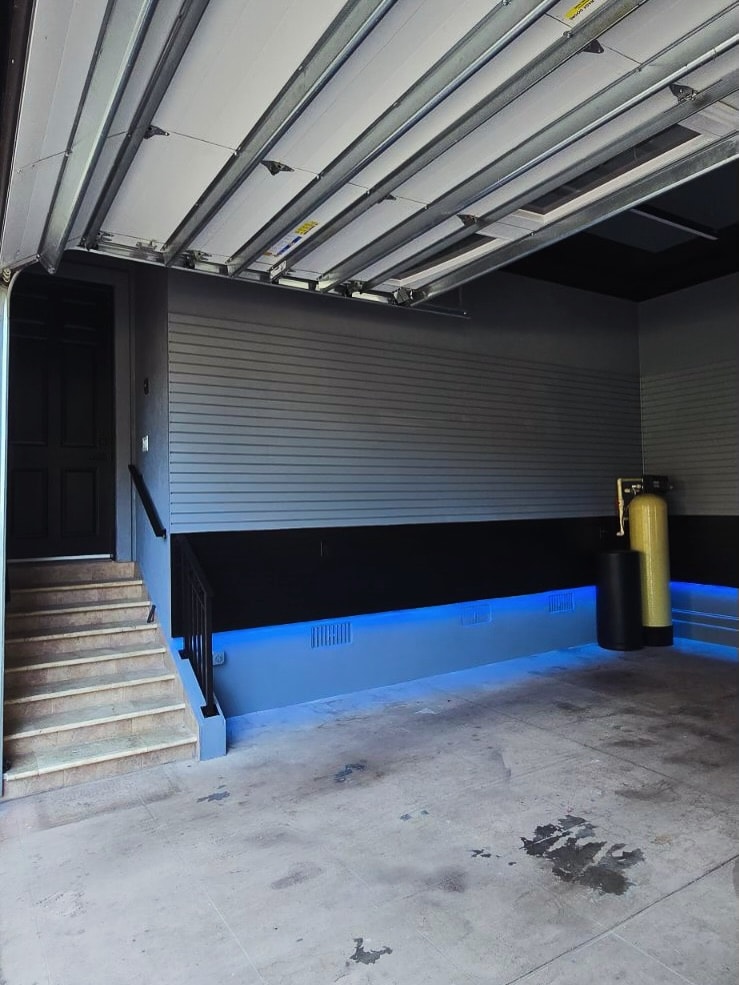
We can build a board and batten wall in a day or two. Picking the color? We've watched that take clients three weeks. The fear is always the same three things: it'll make the room feel small, it'll fight the furniture and floors, or it'll be the thing you're embarrassed about in two years.
Those fears are reasonable. And mostly avoidable, because color on a millwork wall follows different rules than color on a flat wall. Here's how we actually talk it through on jobs across Jacksonville & St. John's County.
The trim changes the color rules
First thing we tell people: you're not painting a wall, you're painting a piece of architecture. Battens, box molding, and slats throw real shadows, and those shadows do half the decorating for you. A color that would read flat and heavy on bare drywall picks up highlights on every board edge and depth in every groove.
That's why a millwork wall can carry a much bolder color than a plain wall. The texture keeps it from becoming a solid plane of pigment staring back at you. It's also why playing it safe can disappoint: paint a detailed grid wall the same builder beige as everything else and you've hidden the carpentry you paid for. If you haven't settled on a treatment yet, our guide to shiplap vs. board and batten is the place to start, because the style you pick genuinely narrows the color question.
Dark colors: when they make a room feel bigger, not smaller
The instinct says dark paint shrinks a room. Sometimes true. But a dark wall also does something people don't expect. It makes the wall recede. The eye reads a deep navy or charcoal plane as farther away, so the room feels deeper, and everything in front of the wall comes forward: the bed, the art, the wood tones.
The royal blue geometric wall below is a good example. That's a small-ish bedroom, and the deep color behind the bed gives it a headboard-to-ceiling anchor instead of closing it in.
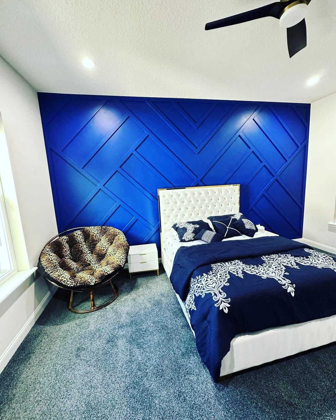
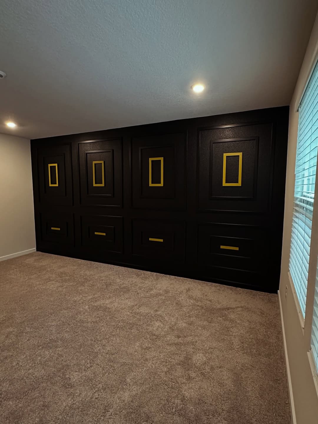
Where dark goes wrong is a room with almost no natural light and dark walls on every side. On an accent wall, one plane with lighter walls around it, the risk is far smaller than people fear. We did a black board and batten wall in Middlebourne that proves the point: black, and the room still feels open because it's one deliberate wall, not a cave.
The black box-molding wall below with the gold accents shows the other thing dark does well. It turns the millwork into jewelry. Every layered edge catches light against the dark field.
Tone-on-tone: the accent wall that whispers
Not every accent wall needs to shout. Some of our favorite walls are painted a shade or two off the surrounding walls, or even the exact same color, letting the millwork texture carry the whole conversation. Greige on greige, white on white, a slate blue that's just a half-step moodier than the rest of the room.
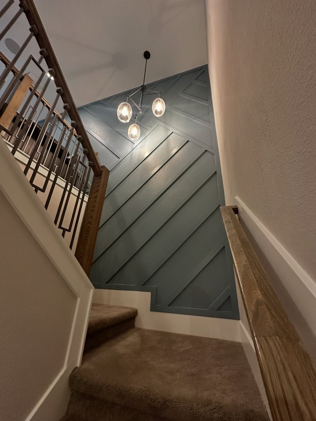
This is the answer for people worried about resale or dating the house. A tone-on-tone millwork wall reads as architecture, not as a paint decision, and architecture ages slower than color trends. The slate blue wall running up the staircase below sits in exactly that zone. Clearly intentional. Calm enough that you could change the whole room around it without touching it.
Testing colors the way we do on jobs
Don't pick from a one-inch chip under the paint store's fluorescent lights. Here's the process we walk clients through, and it takes a weekend:
- Get sample boards, not swatches on the wall. Paint big poster boards, two coats, and move them around the actual wall. Patches painted straight onto the old color lie to you.
- Look at them at three times of day. Florida light is strong and warm, and a color that reads right at noon can go muddy at 7 p.m. under your lamps. Morning, afternoon, night. No shortcuts.
- Hold them vertical, in shadow and in light. An accent wall with battens has shadowed faces, so tilt the board and see the color darker than the chip suggests.
- Check it against the fixed stuff. Floors, countertops, and big furniture aren't changing. The color has to get along with them, not with the photo that caught your eye online.
Two days of that beats three weeks of second-guessing, every time.
The colors we keep coming back to, and why we won't pick for you
After years of these walls, the repeat performers in Northeast Florida homes are deep navies, soft slate blues, charcoal-to-black, muted greens, and warm greiges. Colors with some gray in them. That's what keeps them from going candy-bright and dating fast. The blue board and batten entry below sits squarely in that family: saturated enough to matter, gray enough to last.
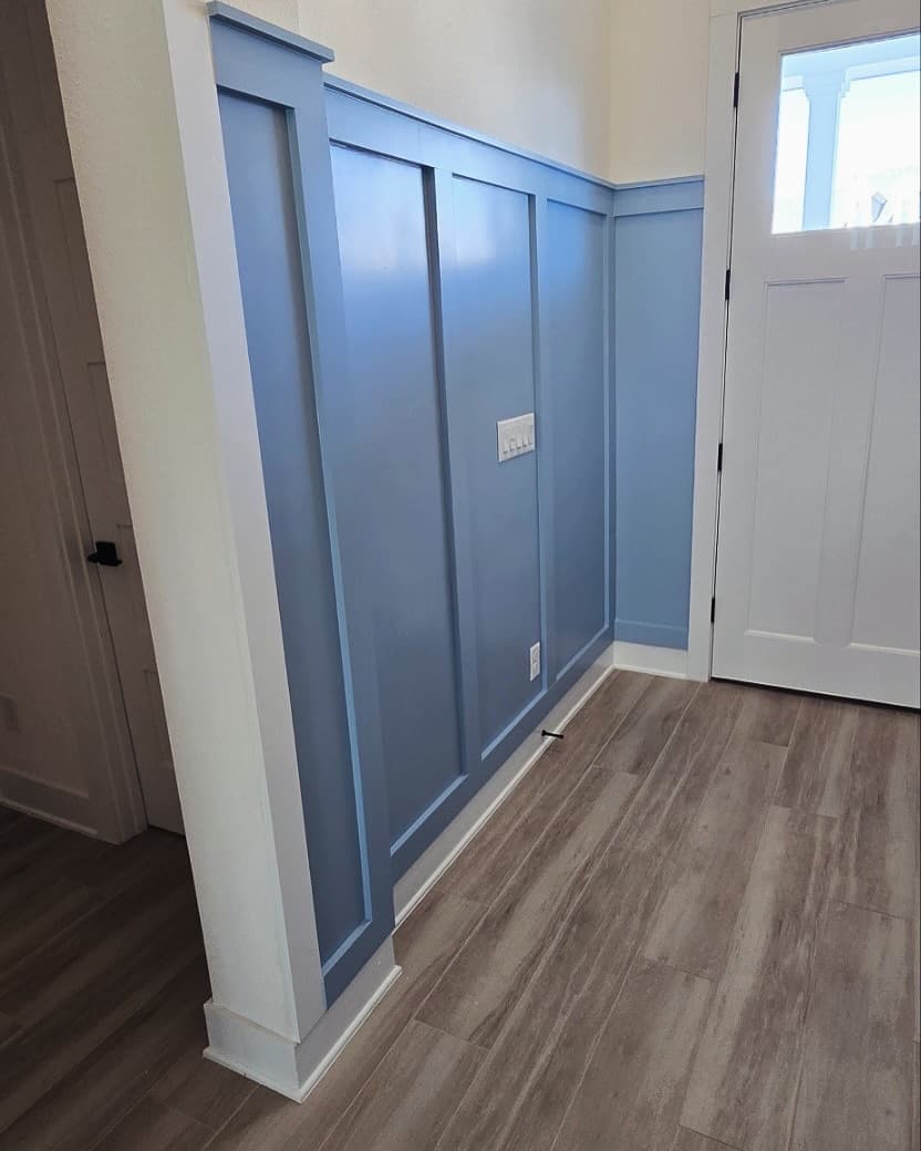
When we paint these walls we spray them with Sherwin-Williams Emerald Interior, usually in satin. Enough sheen to wipe fingerprints off an entryway wall, not so much that every drywall memory shows. But the specific color? That has to be yours. We've seen the same navy look right in one Nocatee house and wrong in the one next door, purely because of window direction and flooring. What we will do is react honestly to your shortlist and tell you when we think a color is going to fight the room.
If you want to see finished color decisions in real local houses, browse the accent wall page or the powder room wall we built in RiverTown. If you're stuck between two finalists, reach out. Bring both, and we'll talk it through before anything gets built.
Tell us what you want built.
We take on a limited number of projects each season. We'll tell you within 24 hours if it's a fit.
Insured · $1M general liability · Serving Jacksonville & St. Johns County